The Godfather
of Korean Typography

Typography on the Web—Designer’s Website.

Ahn Sang-Soo

Influence

Why is Ahn Sang-Soo an influential typographer?


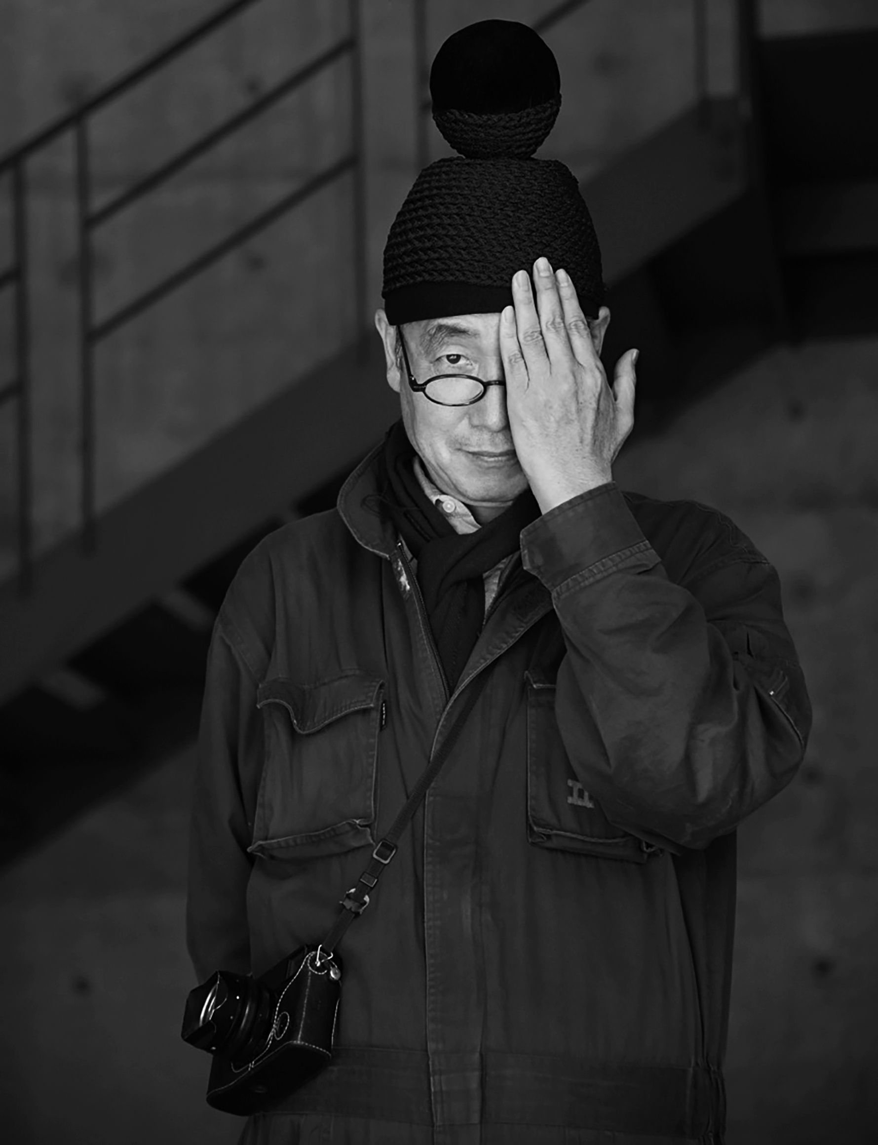
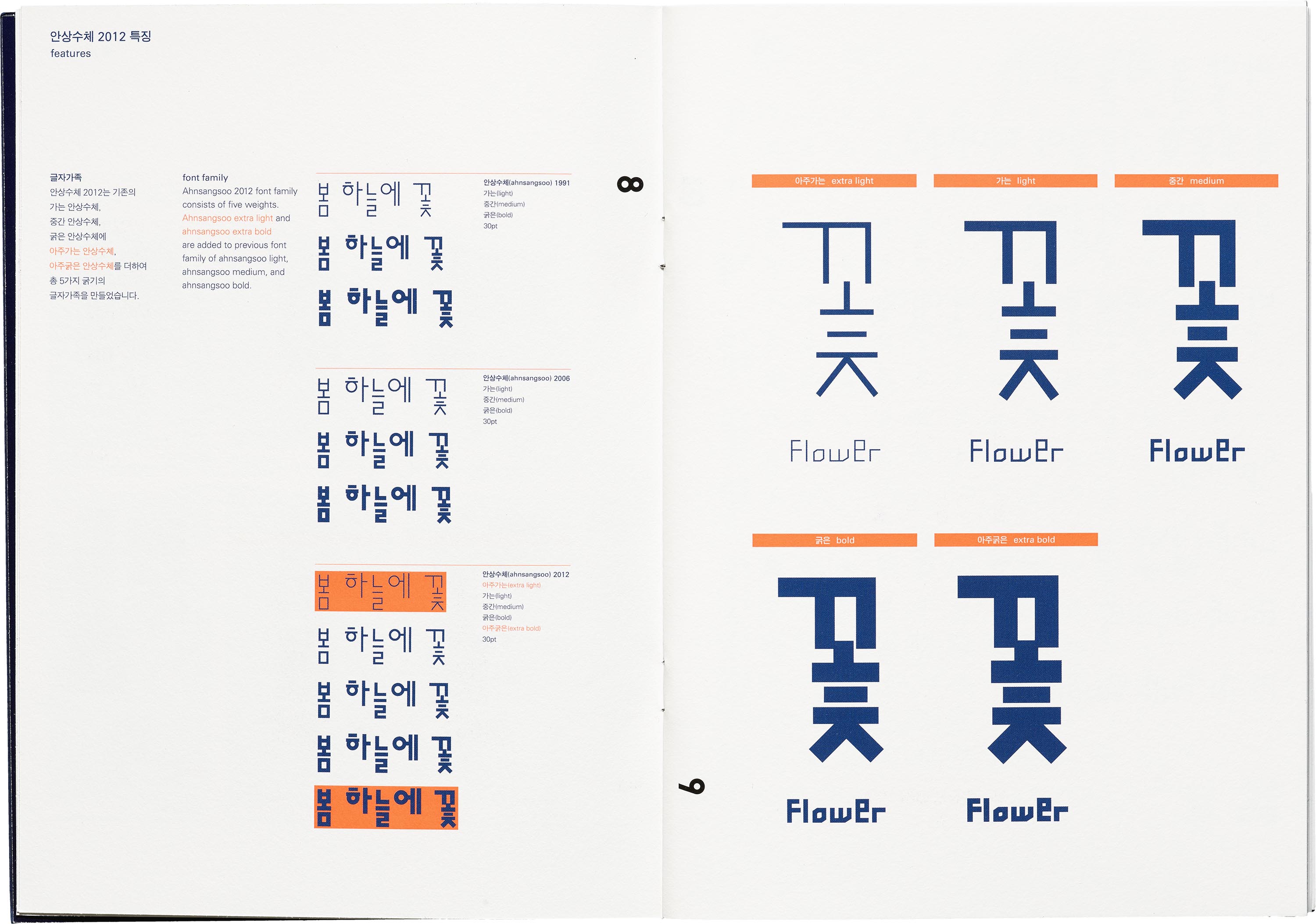
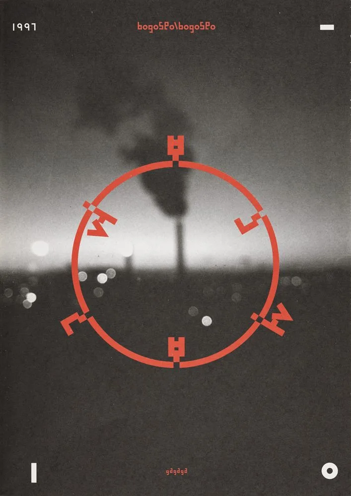
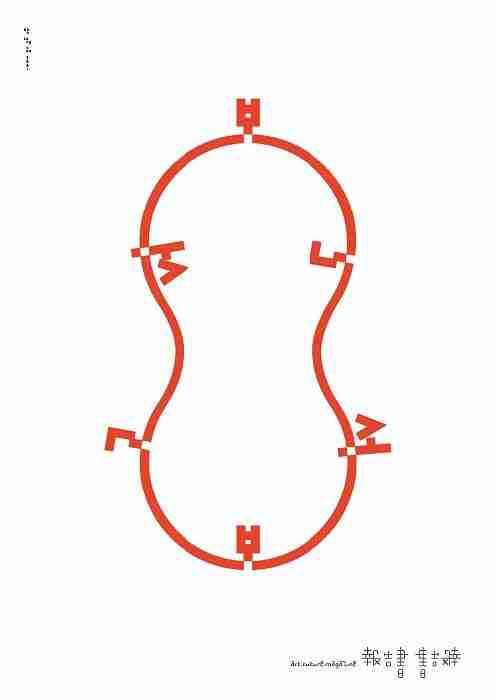
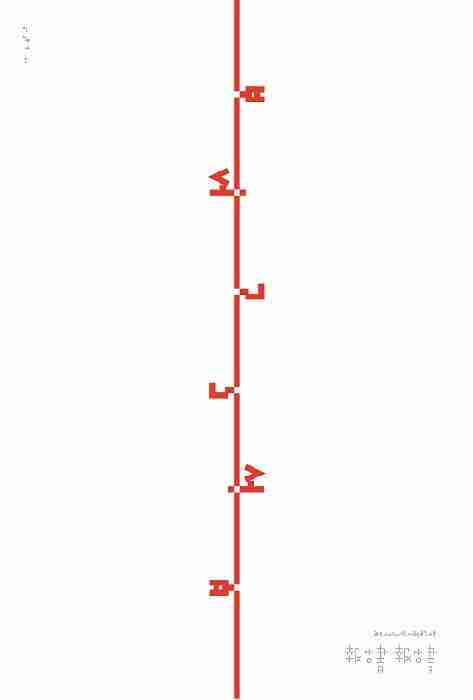
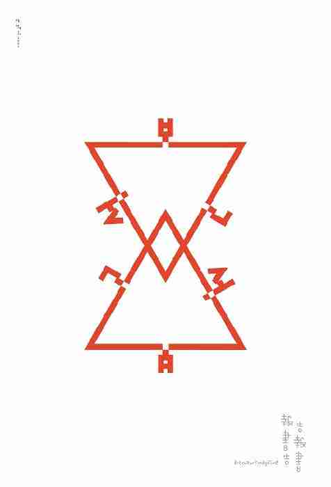
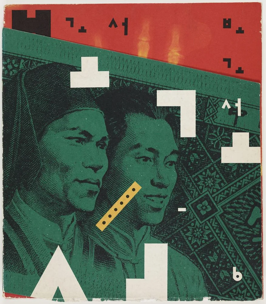
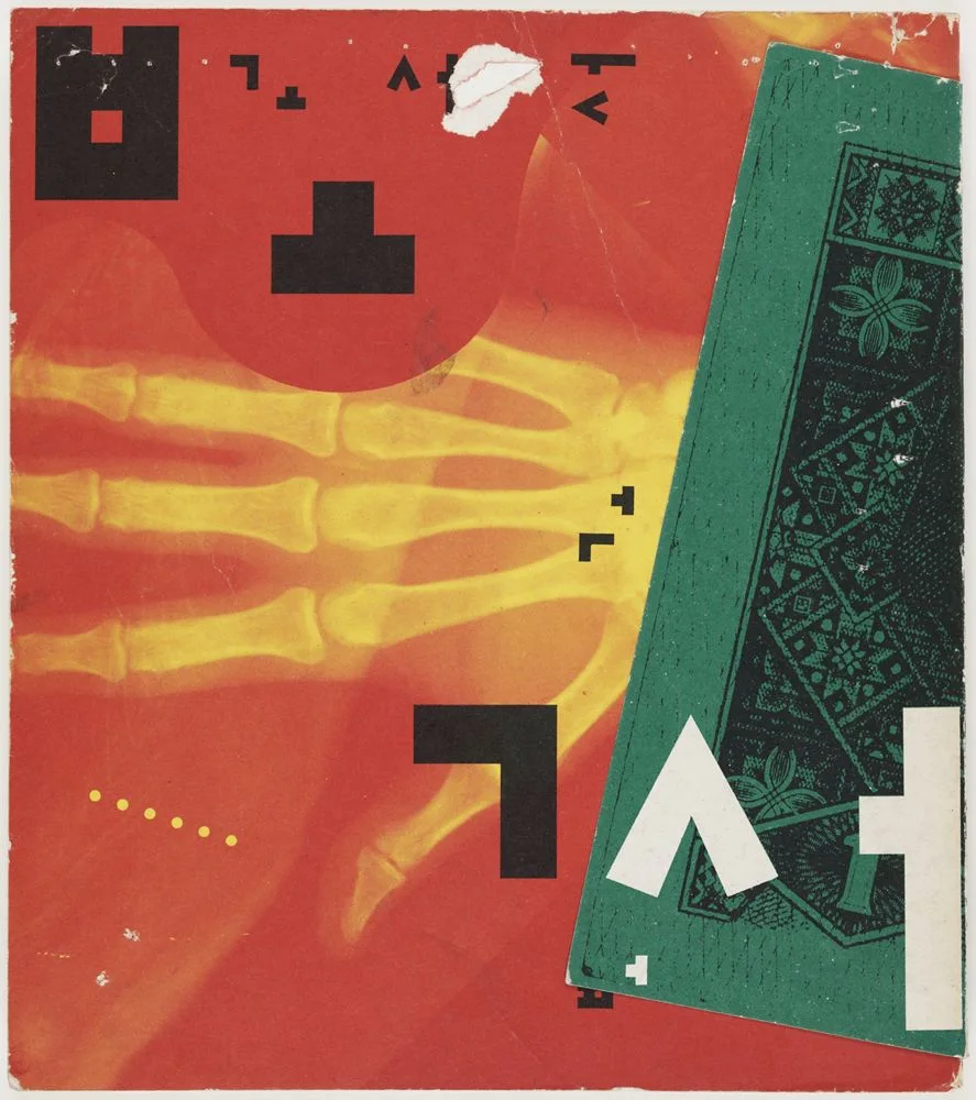
Ahn Sang-Soo is revered as a highly influential typographer for completely transforming the perception and application of the Korean alphabet, Hangul, moving it from a purely functional writing system to a dynamic graphic medium. Before his work, Hangul was largely confined to rigid, traditional constraints inherited from Chinese character formatting. Ahn broke these moulds, proving that the script could be visually experimental and expressive while maintaining its structural integrity. His profound passion for Hangul, which he described as being “possessed” by the script, drove his continuous typographic creativity and his belief that letters are the key to preserving culture.


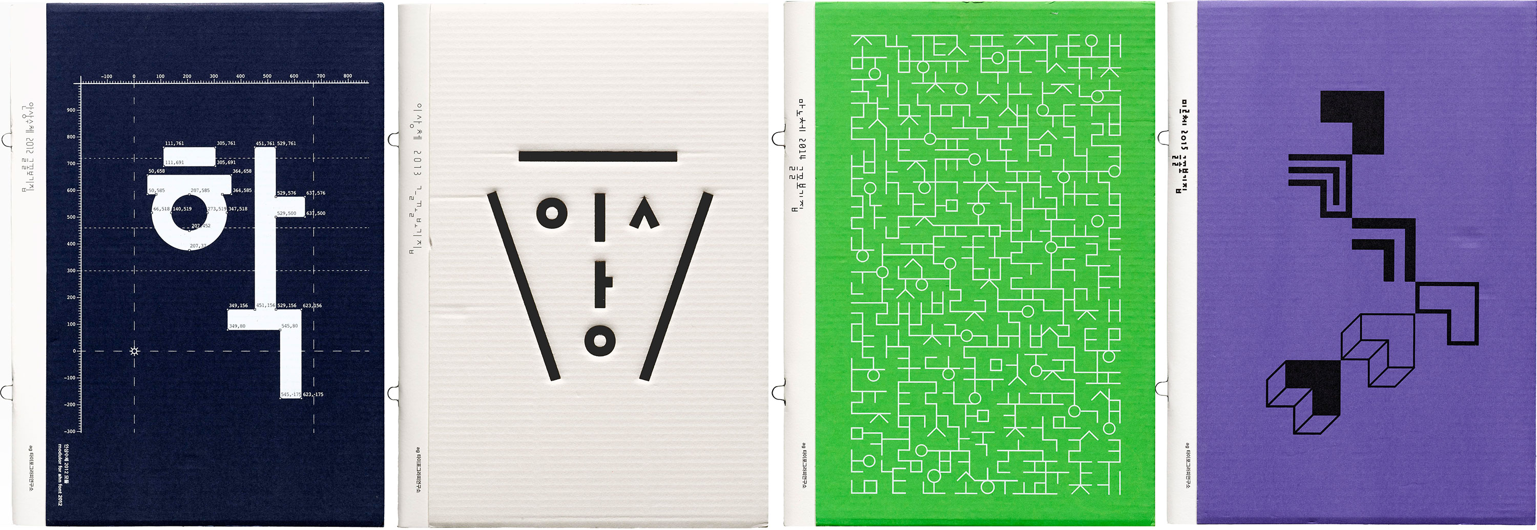
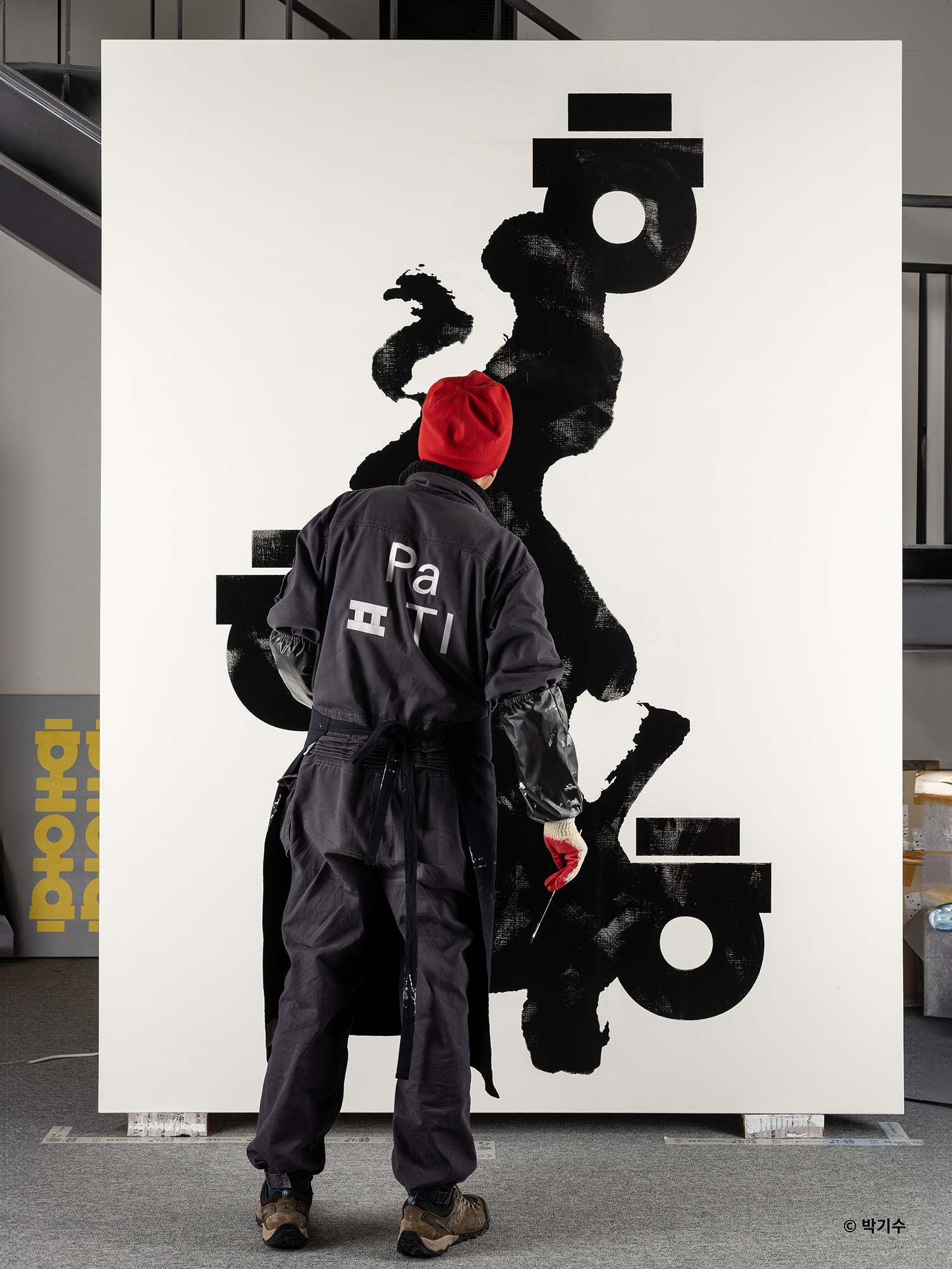
Beyond his personal design achievements, Ahn’s influence is deeply rooted in his extensive career as an educator and institutional leader. He served as a professor in the Visual Communication Design Department at Hongik University from 1991 until his early retirement in 2012. Following this, he founded the Paju Typography Institute (PaTI) in 2012, an alternative design school dedicated to a unique educational program rooted in local culture, where he currently serves as the principal. He also established the AG Typography Institute, an organization committed to the research, design, and exhibition of new typefaces.


Internationally, Ahn has acted as a vital bridge between East Asian design and the global typographic community. He served as the vice-president of the International Council of Graphic Design Associations (Icograda) from 1997 to 2001 and has chaired the international typography biennale, TypoJanchi, since 2001. His innovative contributions and global advocacy earned him prestigious accolades, including the Gutenberg Prize from the city of Leipzig in 2007. Through his combined efforts in groundbreaking design, dedicated education, and international leadership, Ahn Sang-Soo has cemented his legacy as the “godfather of Korean typography,” continually championing the field of linguistic illustration.

Ahn Sang-Soo
Ahn Sang-Soo

Contribution

What is the most significant contribution Ahn made to the field of typography?


The most significant contribution Ahn Sang-Soo made to the field of typography is the conceptualization and implementation of the “de-squared” or “out-of-frame” typographic paradigm, which radically liberated Hangul from centuries-old design constraints. For hundreds of years, the structural rules of Chinese characters dictated Hangul typography, forcing the Korean script’s phonetic building blocks (jamo) to fit neatly into uniform, invisible square blocks. This traditional approach restricted the script’s visual potential. In 1985, Ahn launched his self-titled “Ahnsangsoo” typeface, which shattered this accepted notion and awakened the alphabet’s full geometric potential.


By removing Hangul from its rigid square-framed structure, Ahn proved that the alphabet could be geometrically expressive and structurally sound without being confined to identical square tiles. In his groundbreaking typeface, Ahn assigned equal visual weight to each letter of a syllabic block—the initial consonant, the medial vowel, and the final consonant. Structurally, this allowed the characters to extend beyond the traditional square boundaries in various directions. A notable characteristic of this approach is the direct vertical alignment of the top vowel with the exact mathematical center of the final consonant at the bottom of the syllable.


This typographic revolution had a more radical visual impact than its precursors. Initially, font developers resisted the “Ahnsangsoo” font, questioning whether it even met the standards of proper typography, but it ultimately prevailed and changed the entire viewpoint of Hangul design. Furthermore, this de-squared methodology evolved to include advanced technological optimizations, such as the introduction of “Hangeul group kerning” in the updated “AG Ahnsangsoo 2012” typeface, which ensured even spacing for the complex, out-of-frame letterforms. Ultimately, Ahn’s bold departure from the square frame completely reinvented the field of linguistic illustration for Korean.

Inspiration

What has his contribution inspired/influenced in the field of typography?


Ahn Sang-Soo’s radical contributions have profoundly inspired a culture of experimentation, research, and play in contemporary typography, particularly in the field of Hangul. By breaking the traditional moulds of Hangul, Ahn empowered future generations of designers with the creative freedom to deconstruct, manipulate, and explore the alphabet as a flexible graphic medium. His work demonstrated that typography could be both deeply rooted in historical philosophy and boldly modern, inspiring a widespread typographic movement across South Korea.


Emerging Hangul designers often experience a pivotal moment when encountering Ahn’s work, which reshapes their entire understanding of letterforms. Type designer Ham Minjoo, for instance, cites Ahn as a hero and notes that his 1985 typeface defined an entirely new way of looking at the modular construction of Hangul, which she applies to her own practice. Similarly, his work inspired the concept of “disassembled” characters (puleo sseugi), as seen in the “Leesang” typeface. Designers like Yoon Min Goo learned to appreciate the raw materiality, construction, and inherent beauty of each letter by breaking apart the syllabic block and rearranging the consonants and vowels sequentially along a baseline.


Ahn’s influence is institutionalized beyond individual designers through the Paju Typography Institute (PaTI), an alternative design school he founded in 2012. PaTI actively cultivates a unique educational program that emphasizes Korean cultural identity (jedaum) while encouraging avant-garde design. Through PaTI and the AG Typography Institute, Ahn has nurtured internationally acclaimed designers who continue to push the boundaries of visual communication and interface design. His lifelong dedication to teaching and collaborative creation ensures that his philosophy—viewing letters not just as functional tools, but as an essential part of cultural heritage and graphic expression—continues to inspire the global design community.